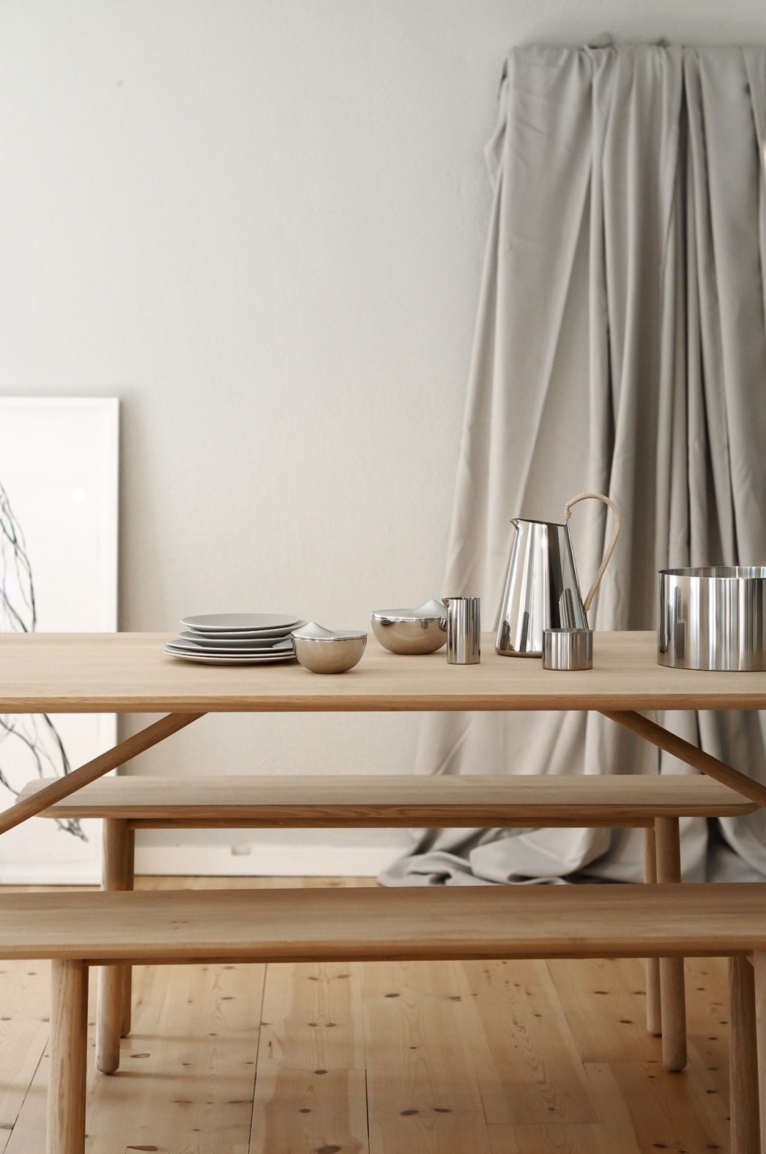
3 Days of Design came around again this year and it seemed to be twice as big! Exciting to see how my favourite design festival is growing. This year Stelton joined the program and opened up their head office and studio in Christianshavn. Their main exhibition was the new Foster collection designed by Sir Norman Foster. But what was actually more exciting (sorry Norman) was that I styled an area for Stelton!
Call this my 3 Days of Design launch if you will. It’s the first time that I’ve collaborated with a company in Copenhagen that is outside of my house. And we all know how excited I get over this festival, it was the perfect opportunity to showcase my styling work now that I am based here. 
Stelton’s head office is in this beautiful building in Christianshavn, Copenhagen. The area where I styled was the back corner of the second floor. Beautiful original beams, window alcoves and potentially troublesome low ceilings. The showroom was set up to showcase the Stelton and RigTig collections in a uniform, conceptual/shop like way. I had the idea of making this area feel like a home. In a way, creating a space that reflects the feel of my home and style. A calm space with products that I love.
Alongside the idea of styling a calm, minimal home space, I wanted to share what I love so much about Scandinavian design and how it inspires me daily. The simplicity of design, enjoying cosy moments like sitting by the window drinking a coffee, supporting local companies and designers. And how I use my home to style collections like Stelton’s.

I planted fresh thyme and rosemary in storage boxes by RigTig. To awaken the senses, giving the space a naturally fresh scent.

To soften the space I brought curtains from my home, meant for my bedroom but I couldn’t get the idea out of my head to use them, glad I did!.

Using products from both Stelton and RigTig I found pieces designed by some of my favourite designers such as Arne Jacobsen (the Cylinda Line collection) and Cecile Manz (Easy collection for RigTig). You’ll also find items such as the Caravaggio floor lamp (designed by Cecile Manz) and geometric cushions originally designed by Arne Jacobsen from Fritz Hansen and Lightyears. This was to highlight how many Danish designers have worked for multiple companies. Those companies tend to support each other in celebrating the designers they choose. So here was my nod to the designer’s work.


Together with the items from Fritz Hansen I sourced items from local companies. Magnus Olesen (in the same building) have a beautiful range of furniture, I chose to use was the Freya lounge chairs. One upholstered in leather and the second part upholstered which they actually MADE to order just for my set (so kind)!
I love the cosy feeling of this corner and on one of the days I saw an old man sit back and pick up the Dosier newspaper and relax. Using my space as the calm, homely space I intended. That felt nice.

The beautiful artwork is from a local print works what I must cover on the blog. Edition Copenhagen is any art/print lovers dream. This original lithograph is called Swoon by artist Catherine Raben Davidsen.

I avoided styling the dining table in the traditional sense, set plates/dinner party style, because I don’t really find it that exciting. Instead I opted for a collection of my favourites, styled in the way I’d shoot for my blog or Instagram.

Coffee tables by Magnus Olesen

Cushions designed by Arne Jacobsen for Fritz Hansen.

SO that was my set! I hope you liked it, I had fun doing it! a full list of products featured below.
Stelton
Cylinda Line Salad bowl, salad cutlery, sugar bowl and milk jug | Theo cup | Theo french press | EM dessert fork | Emma plates | Freja Jug | PEAK medium and small | Concave vase | Erik Magnussen ship lamp
RigTig
Goodies Glass jar | Woodstock wooden Boxes | Wooden spoons, Easy Collection
Magnus Olesen
Freya Lounge chair | Trio tables
Skagerak
Hven dining table 170cm Oak | Hven benches 125cm Oak
Fritz Hansen
Origami Basket designed by Cecile Manz | Cashmere throw | Aiayu cushion oatmeal | Vertigo pillow rectangle and square designed by Arne Jacobsen
Lightyears
Caravaggio read lamp designed by Cecile Manz
Edition Copenhagen
Lithograph; Swoon by artist Catherine Raben Davidsen.


H x
Photography/images © Hannah Trickett/Hannah in the house
A special Thank you to Stelton for this collaboration and Fritz Hansen, Lightyears, Magnus Olesen, Skagerak and Edition Copenhagen for loaning their beautiful products.


2 Comments
Such beautiful styling Hannah! And congratulations on the collaboration – I hope it’s the first of many like this x
Love it Hannah!